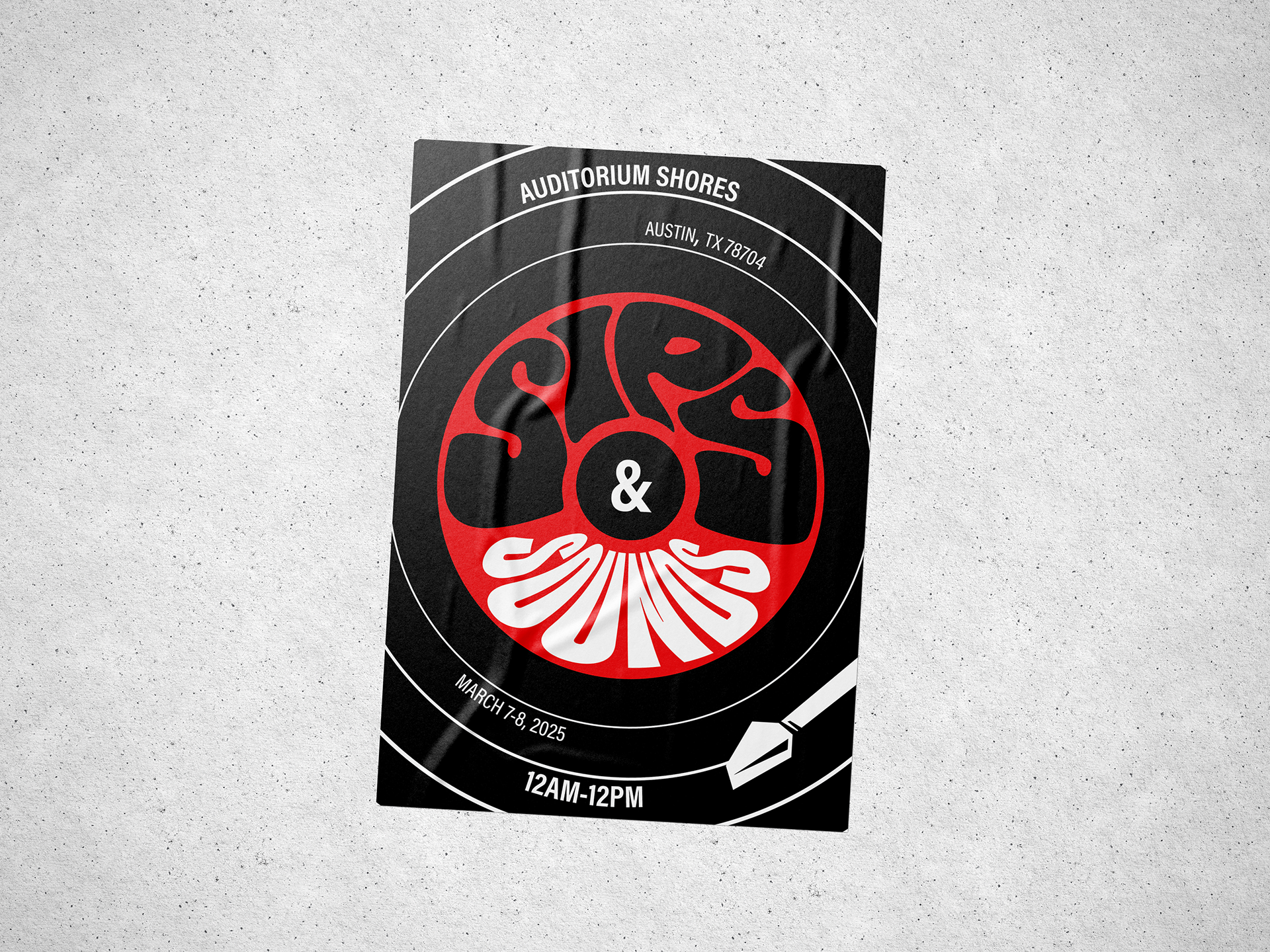
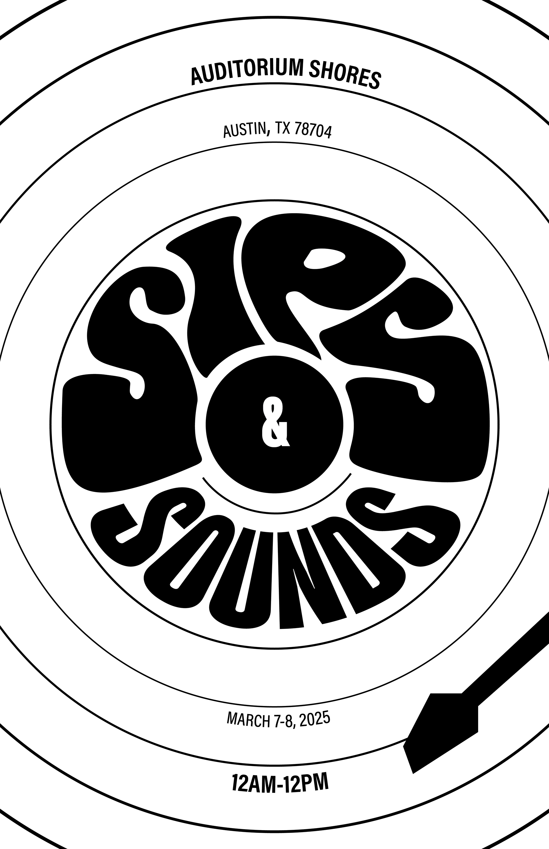
SIPS & SOUNDS
2025
Sips & Sounds is a short two-day yearly music festival in Austin, TX that features performances from the brightest up and coming artists between years.
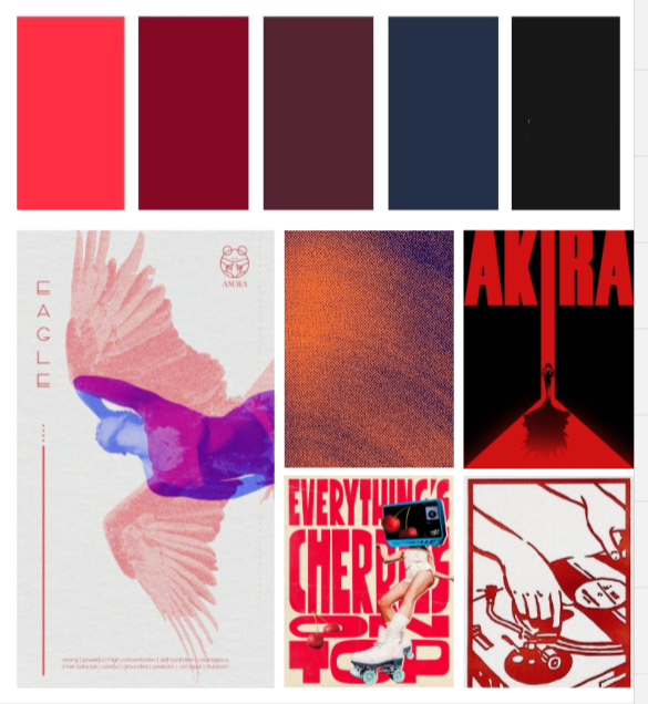
I wanted to create a festival poster that would attract eyes and intrigue, leaning into a trendy and bold theme.
THE GOAL
My goal with this project was to bring a more lively, personal, and exclusive feel to an otherwise more simple corporate branding. I wanted to make a poster that felt "in the moment" and caught eyes to ask for more.
THE TEAM
LeeAnn Partin
Creative Director
Designer
Creative Director
Designer
SERVICES
Print Flyer
Digital Advertisements
Festival Badges
Digital Advertisements
Festival Badges
AUDIENCE
Single adults, music junkies, ravers, currently in college.
CONSTRAINTS
Having only one color with black and white makes it more essential to be intentional with where I use it. Also with how bold of a look I was going for, I needed to balance the amount of text I include.
PROCESS
My design process for this project included mood boards, several sketches, digital drafts testing out certain concepts, and revisions.
I was inspired by hand drawn lettering, unique typographic organization, and bold designs that filled the whole page.
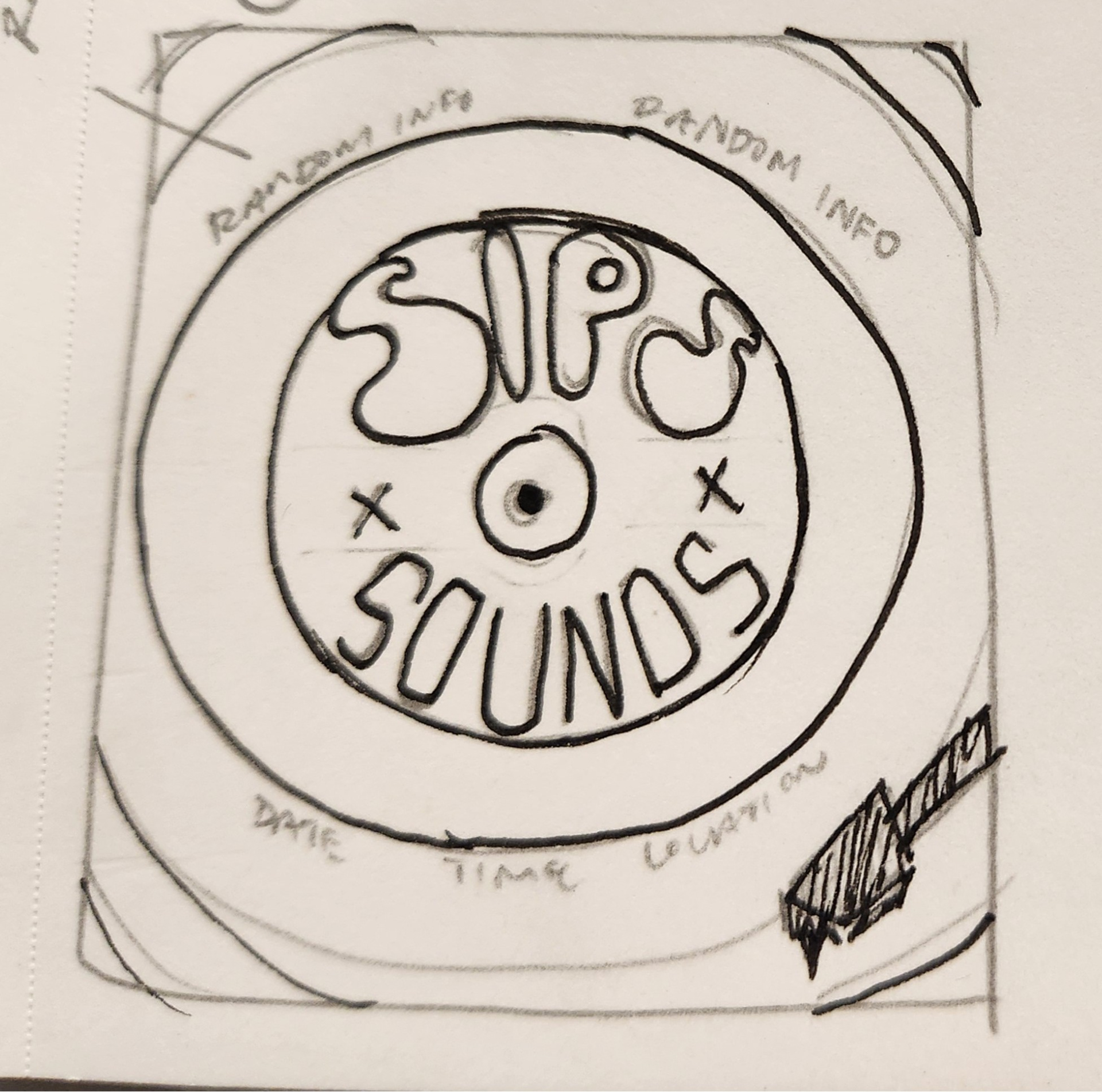
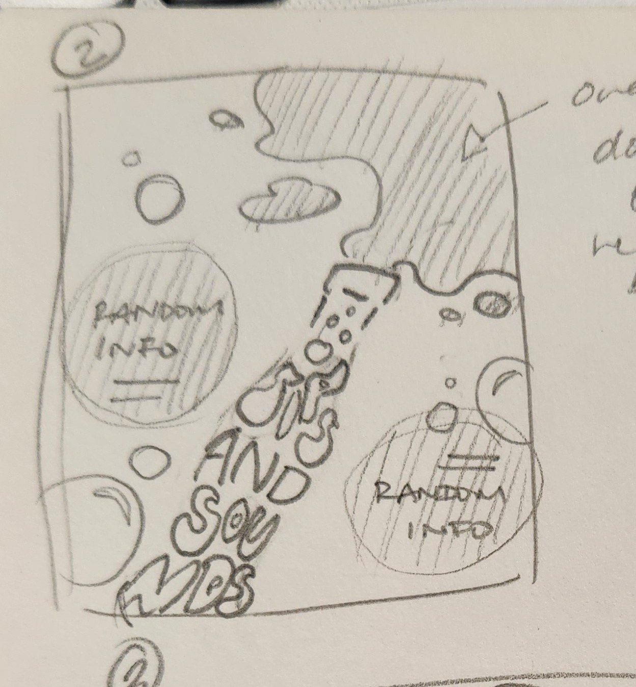
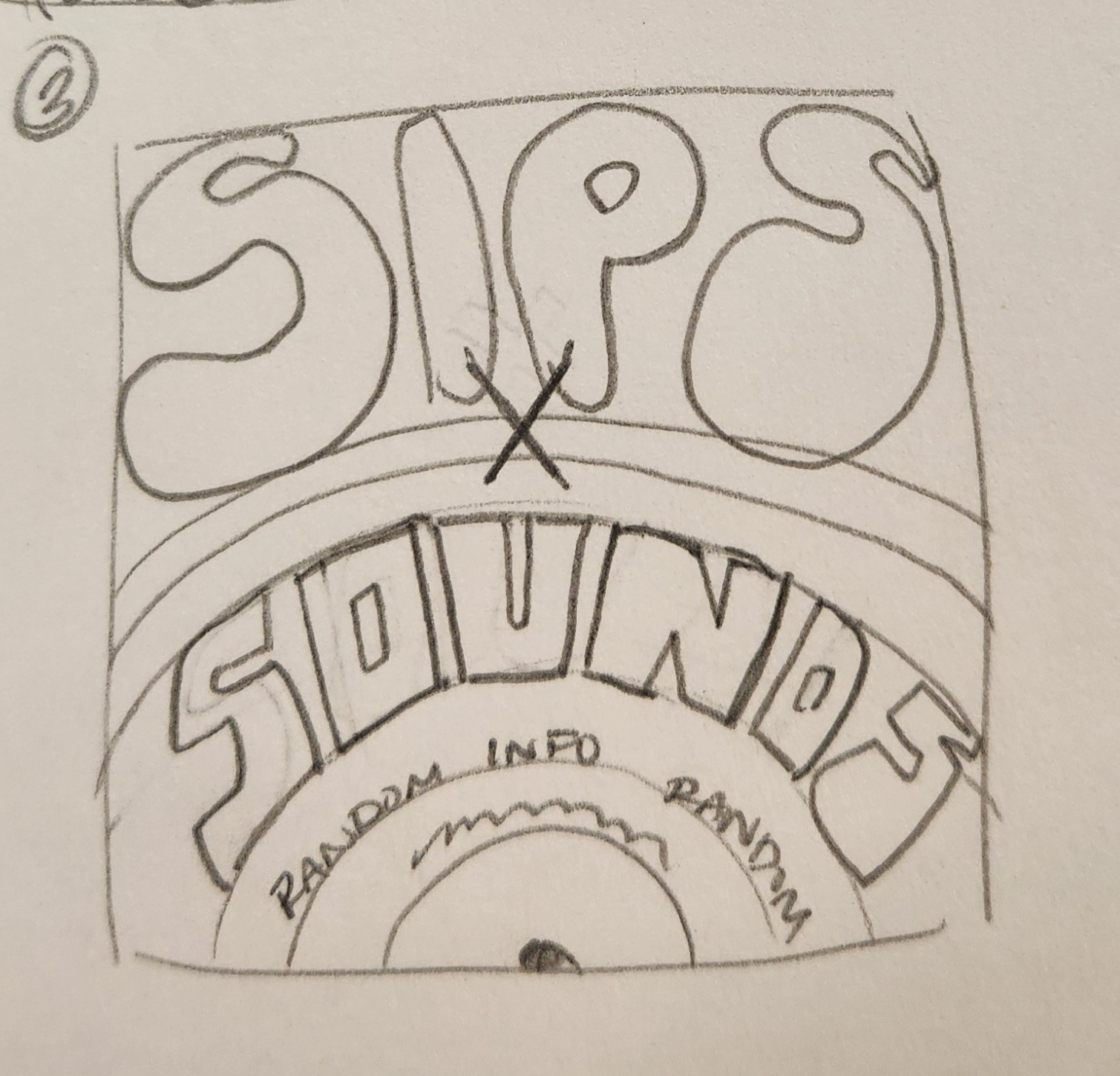
I made several iterations of two main versions out of uncertainty, but landed on one that felt right. I wanted it to feel more sleek, with a clear hierarchy- which are elements that I found in my final product.
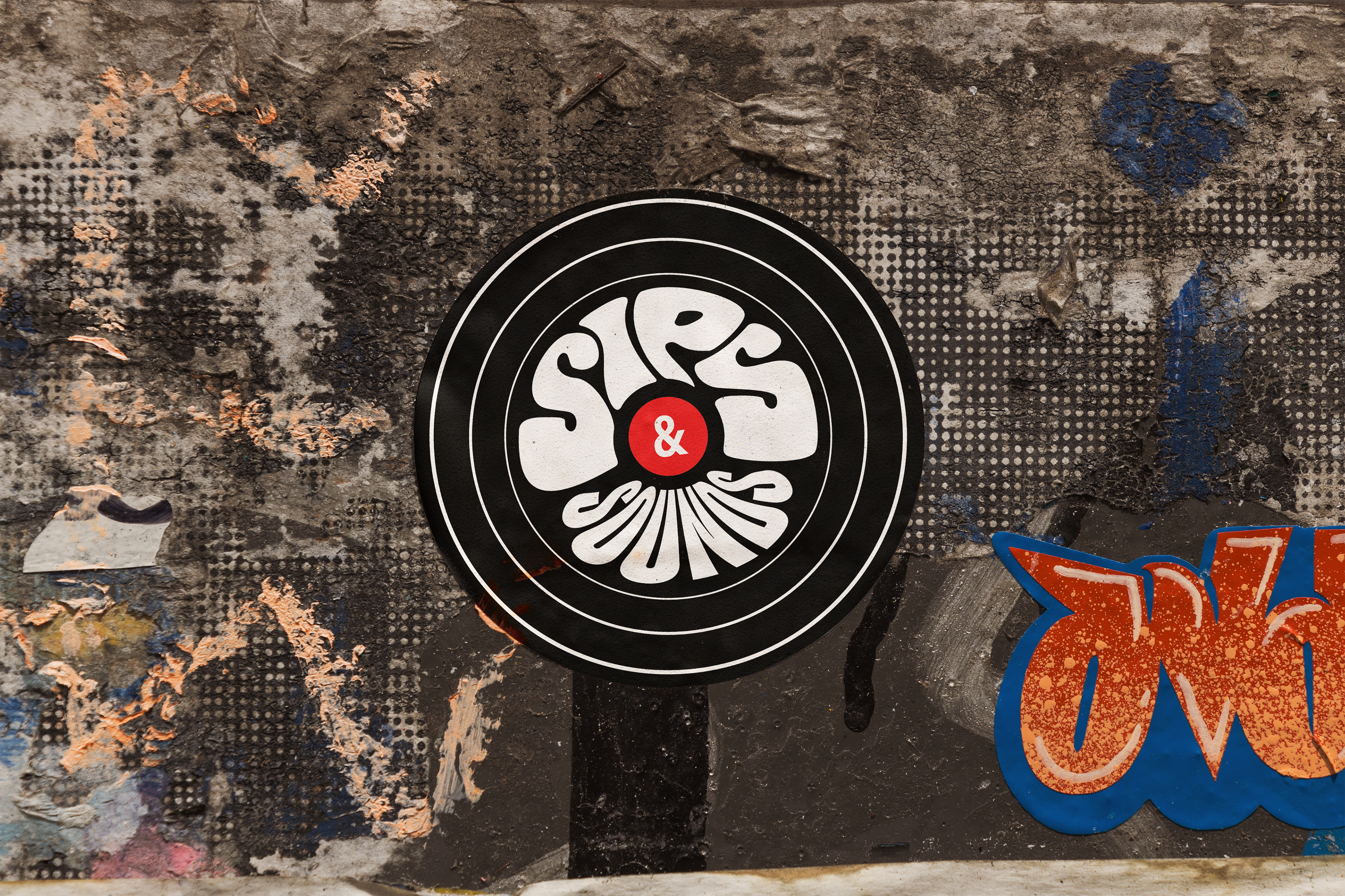
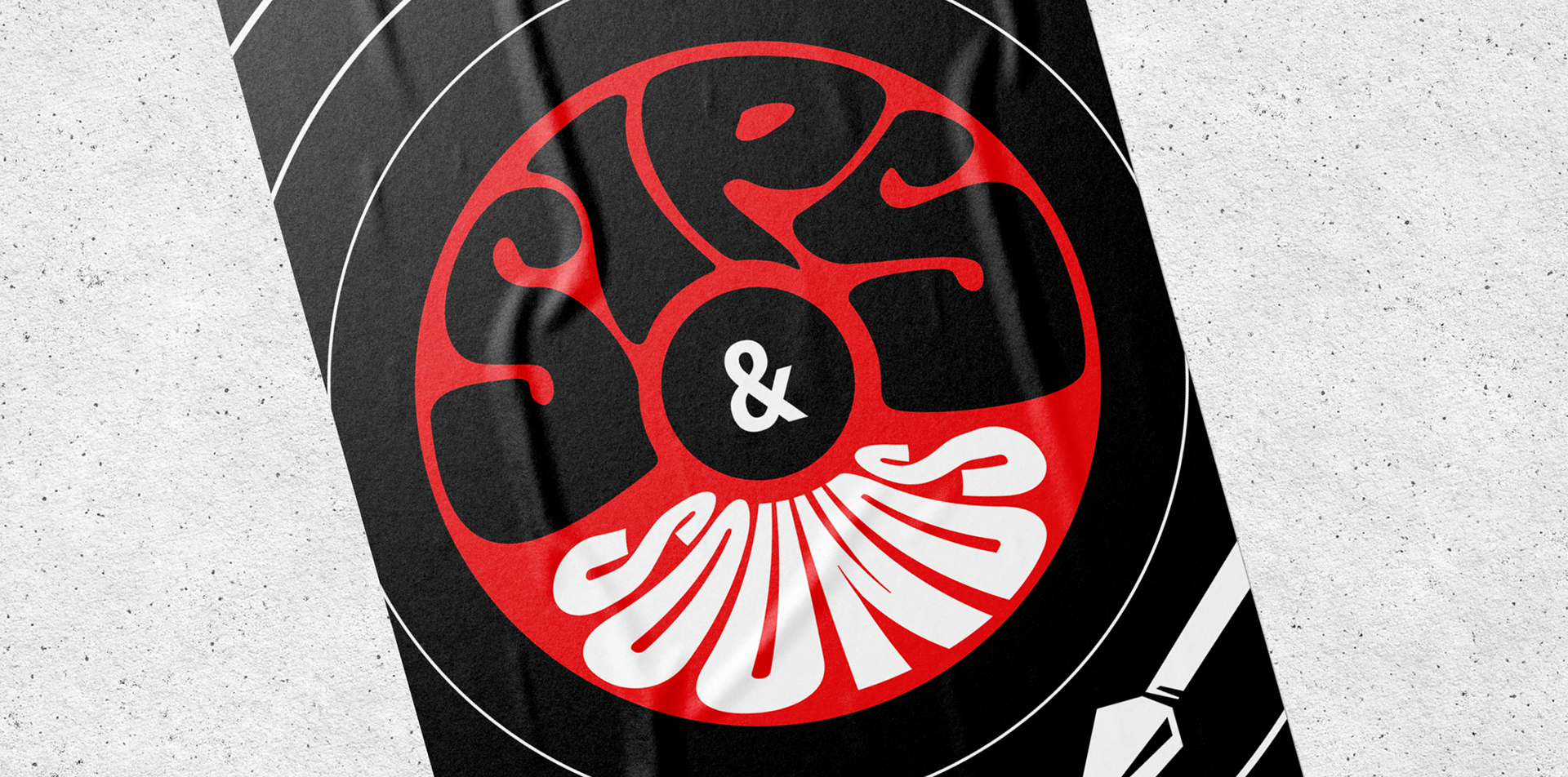
THE SOLUTION
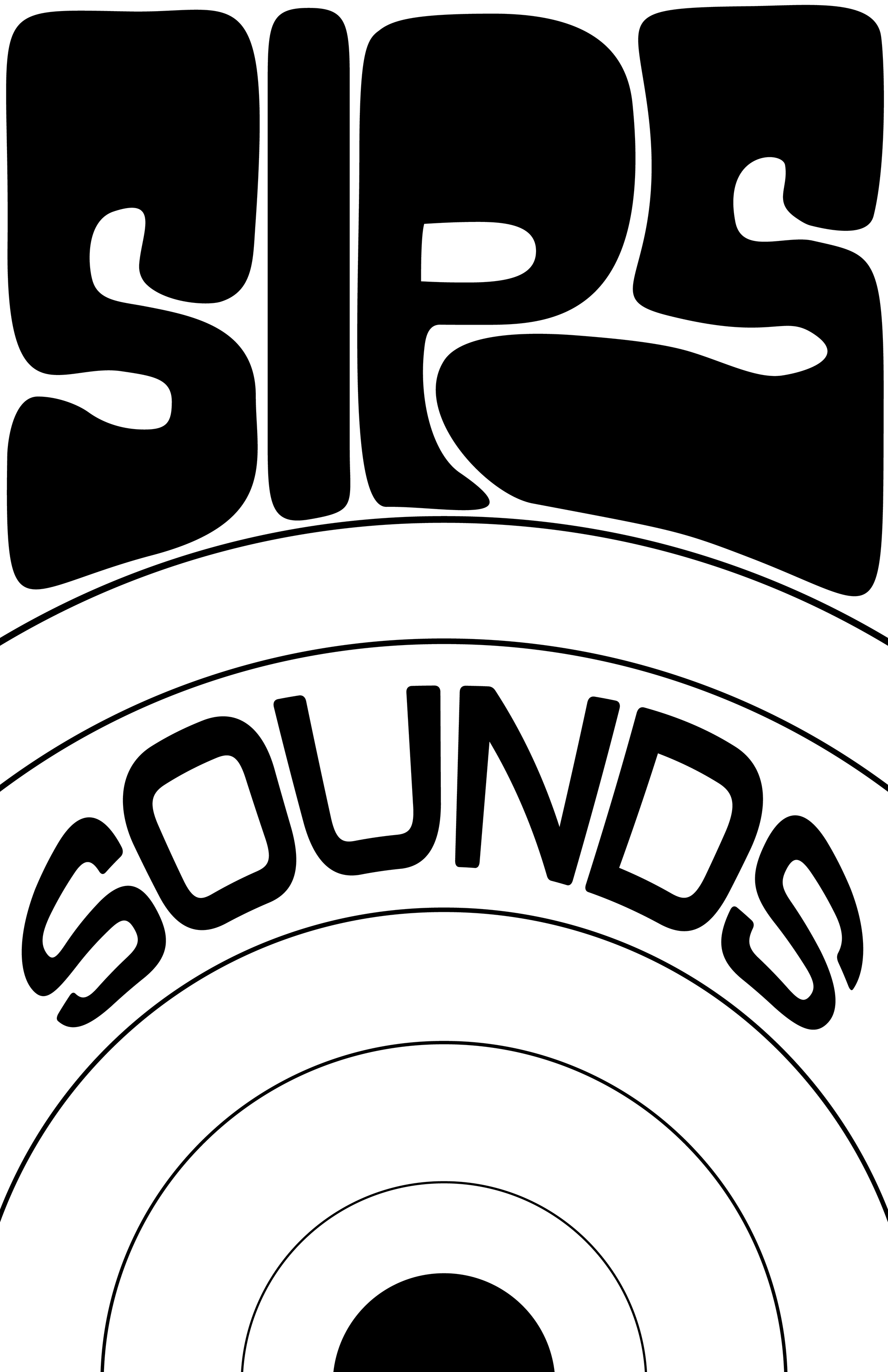
I took a lot of the simple brand inspiration from the original design, and made it more interesting; turning the waves into a record player, and the one drip of red into the focal point of the poster instead of a secondary thought.
I used hand drawn type to create a feeling of excitement, exclusivity, and as a counter to the rest of the clean sans serif type.