RIA
2025
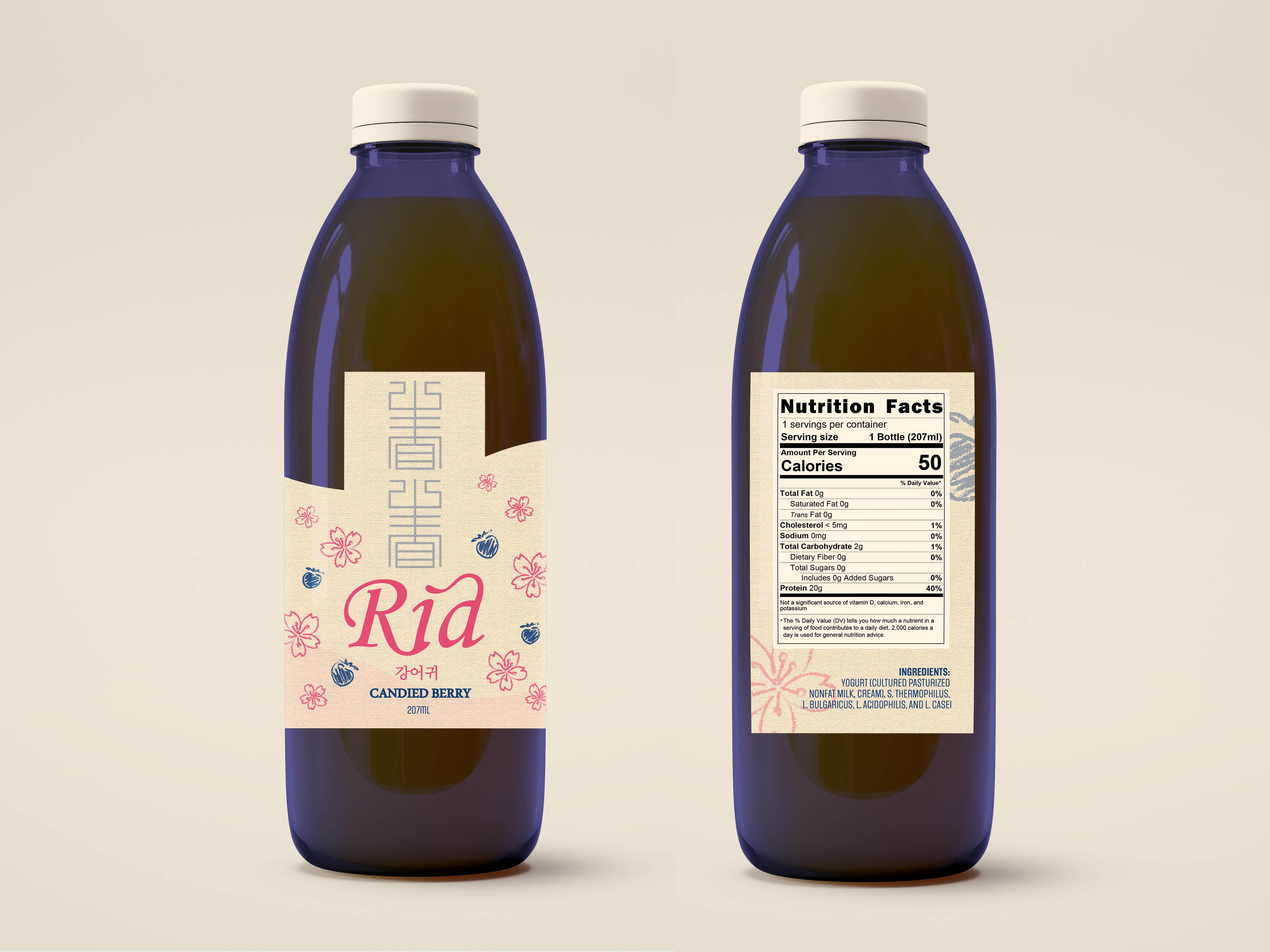
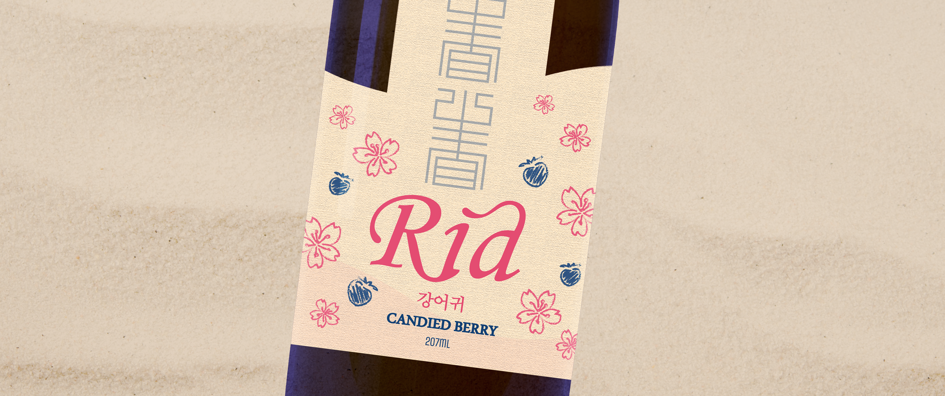
RIA is a yogurt beverage that takes a journey worldwide, through freedom and culture in every flavor- from bursting mango to candied berry! RIA will be a brand that's inspired by a look into the past, and incorporating travel and culture to make the experience feel alive.
The direct translation of "RIA" means estuary which is a direct representation of what we're trying to achieve: meeting cultures, freedom, and history into one place together.
THE GOAL
The goal is to incorporate multiple culture in one consistent style, highlighting their differences, but finding a central theme that ties all of them together. I want to highlight the cultural elements from each region, and create a brand that feels like a worldwide experience.
THE TEAM
LeeAnn Partin
Creative Director
Designer
Creative Director
Designer
SERVICES
Logo
Bottle Label
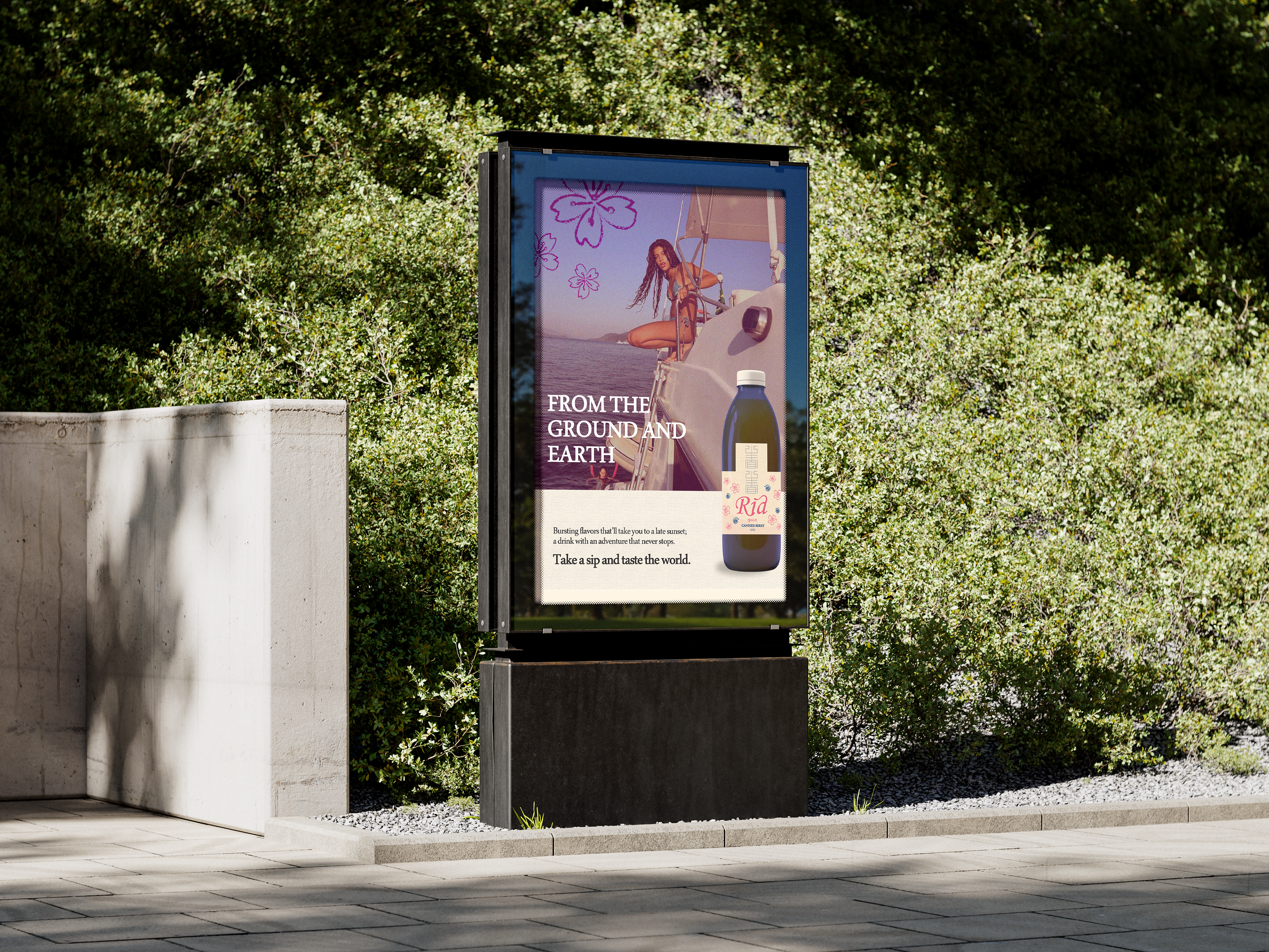
Print Advertisements
Bottle Label
Print Advertisements
AUDIENCE
Young travelers looking for authentic experiences, & disposable income for finer products.
CONSTRAINTS
Multiple messages can get messy quickly, so I have to keep it simple. To stay in line with this, I'm restricting myself to only 1-2 colors other than the background per flavor. This is also my first time designing for a more organic shape, so it's a small learning curve.
PROCESS
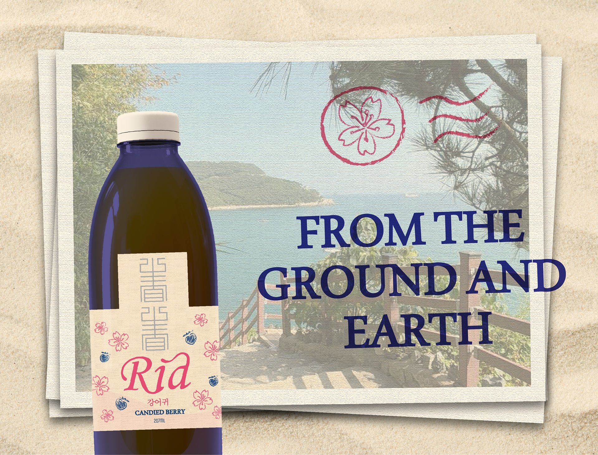
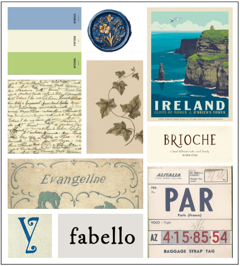
My design process for this project included mood boards, several sketches, digital drafts testing out certain concepts, and high quality final revisions. I wanted to create a brand that included cultural elements of course, but also invoke a feeling of travel and freedom.
I was inspired by vintage postcards, sea travels, hand drawn art and letters, and the concept of a "message in the bottle."
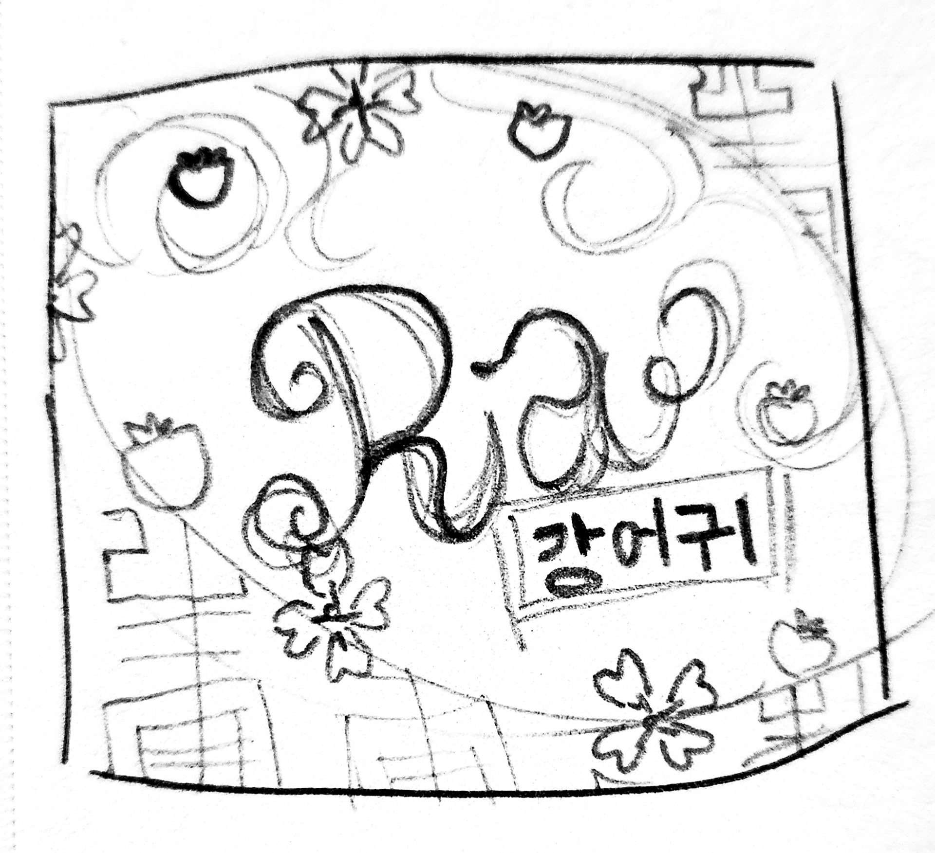
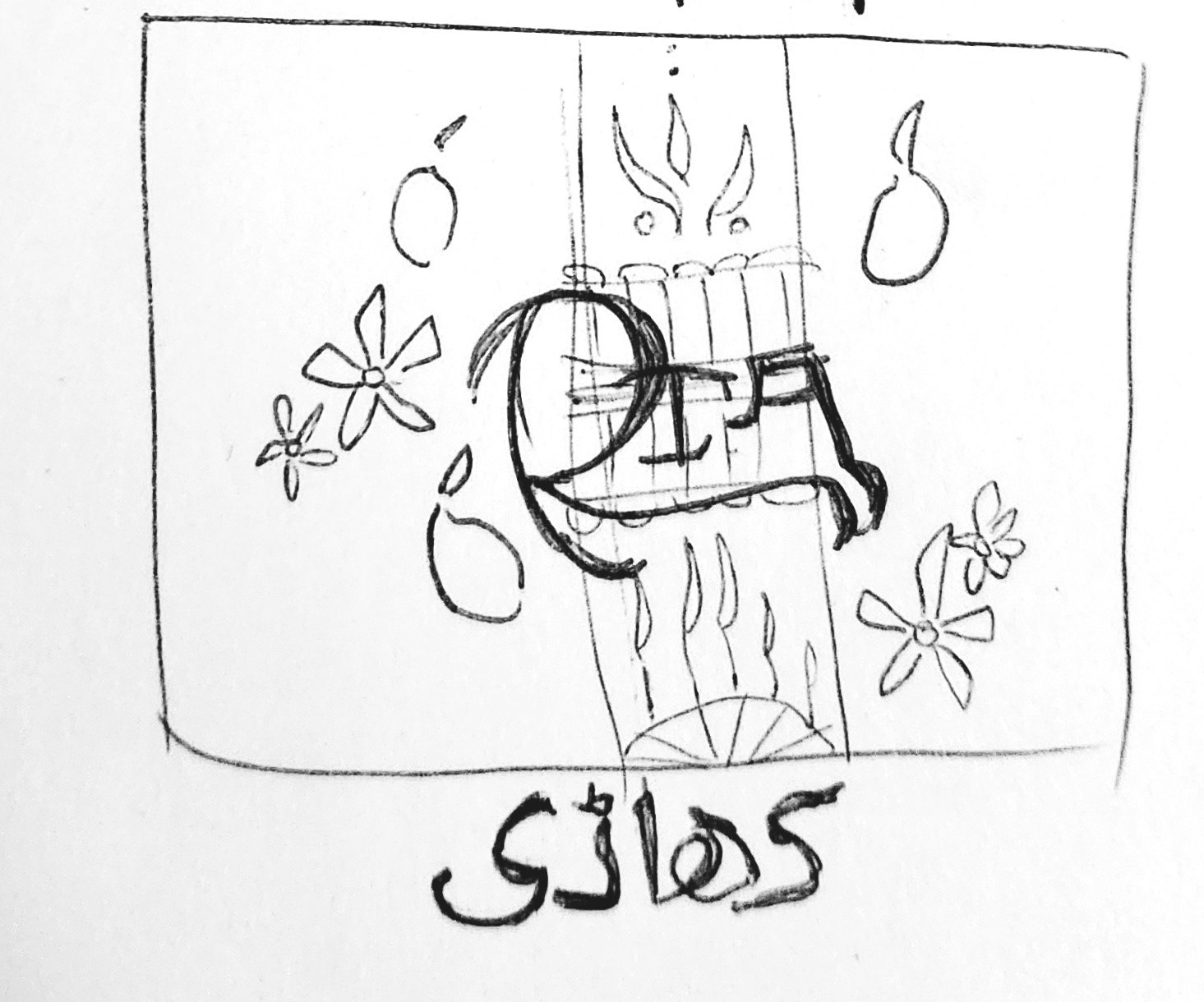
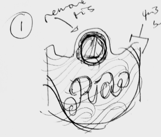

I made several digital concepts playing around with each culture's florals and fruit, as well as die-cuts for the bottle label. I ended up taking the flavor from the left concept and using it on the right concept, as it felt more concise and clean.
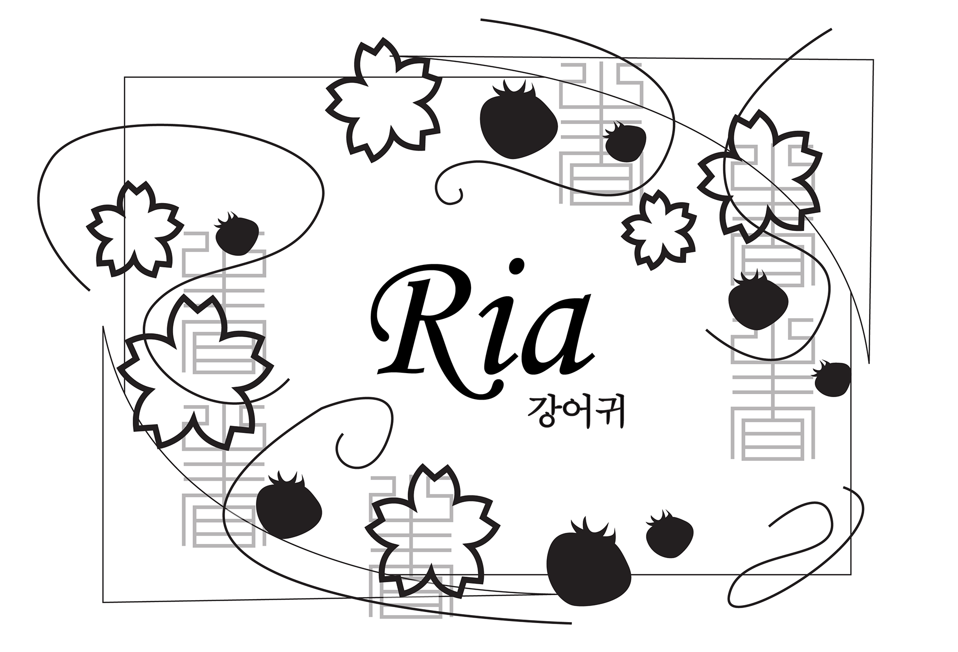
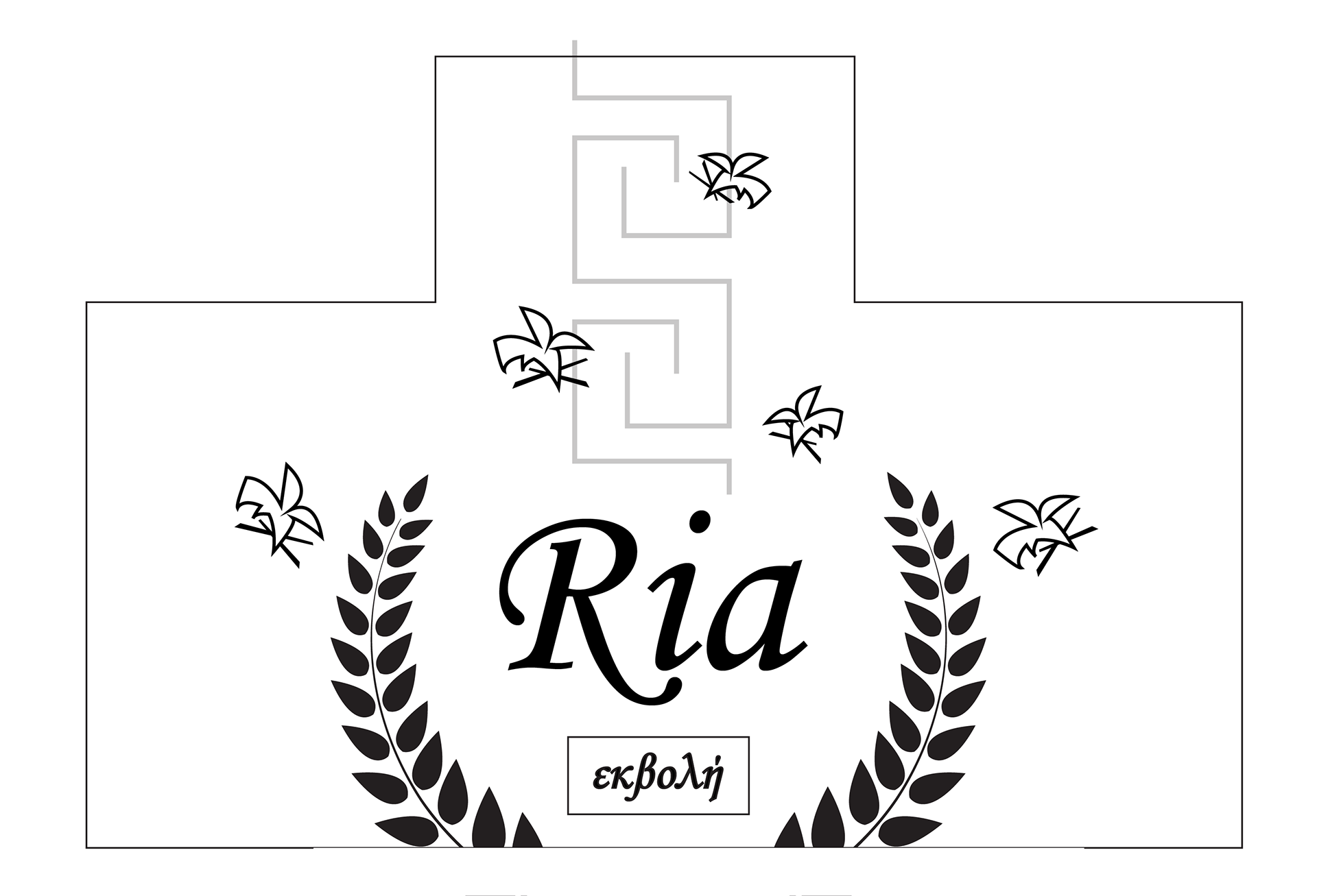
THE SOLUTION
As a callback to the vintage postcards, ocean feelings, and parchment, I settled on a creamy white for the base, with a paper texture to make it feel real. The logo and surrounding elements are hand drawn, bringing a personalized and authentic style to the beverage.
Through both the colorful wave and die cut of the bottle label, it brings in those more organic oceanic elements. I also included the name "Ria" translated into the language for that culture, to add a more human touch.