RADIO SILENCE
2025
Radio Silence is a novel written by the popular author Alice Oseman, more known for her series "Heartstopper." This novel focuses on Frances and Aled, an unstoppable, but unexpected duo and their journey through the ups and downs of senior year.
This story follows their journey back to each other as best friends, dealing with extreme family problems, mental health, and expectations as a teenager.
THE GOAL
My goal with this project was to bring some personality and color back to the original book, including major themes and significant characters.
While the original cover holds a special place in my heart, the first time I picked this book up was a stroke of luck. I want to change that into intention, and bring that feeling of uncertainty the original had, but in a different way.
THE TEAM
LeeAnn Partin
Creative Director
Designer
Creative Director
Designer
SERVICES
Book Publishing Cover
Print & Digital
Print & Digital
AUDIENCE
High School to Young Adults, coming-of-age genre lovers, and people who are academically burnt out.
CONSTRAINTS
Time frame was a quick turnaround with the deadline I had. There's also lots of information on a book cover I didn't account for, which requires lots of ideating.
PROCESS
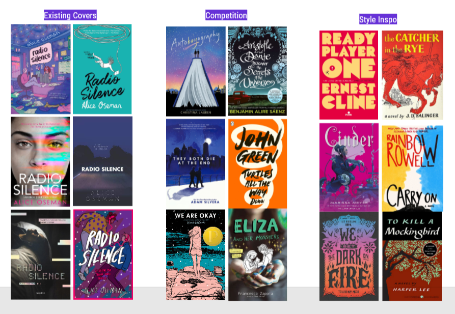
My design process for this project included mood boards with book cover inspiration, fleshed out sketches, and final revisions.
I did a lot of research into my favorite book covers, styles I liked, typography, the use of negative space, photography, and colors. I took the most inspiration from Catcher in the Rye, Cinder, & We Set the Dark on Fire.
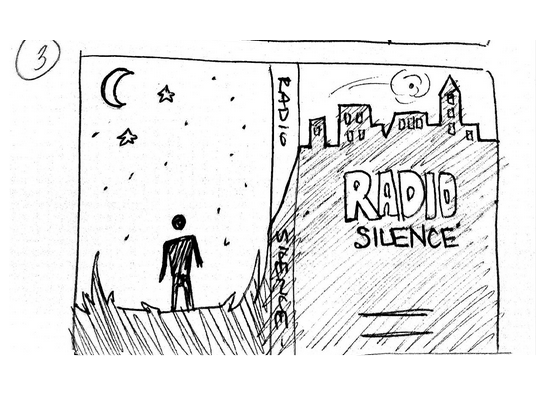
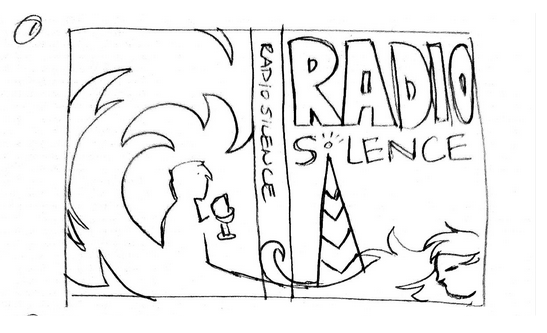
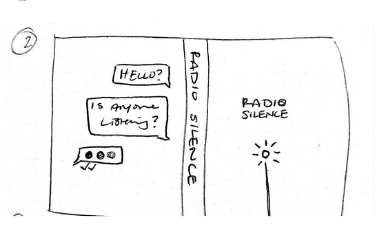
I combined several of my sketches into my three favorites, ranging from super detailed, some detail, to pretty minimalist. While I loved my more minimalist one, the goal here was to add more detail and story, not detract.
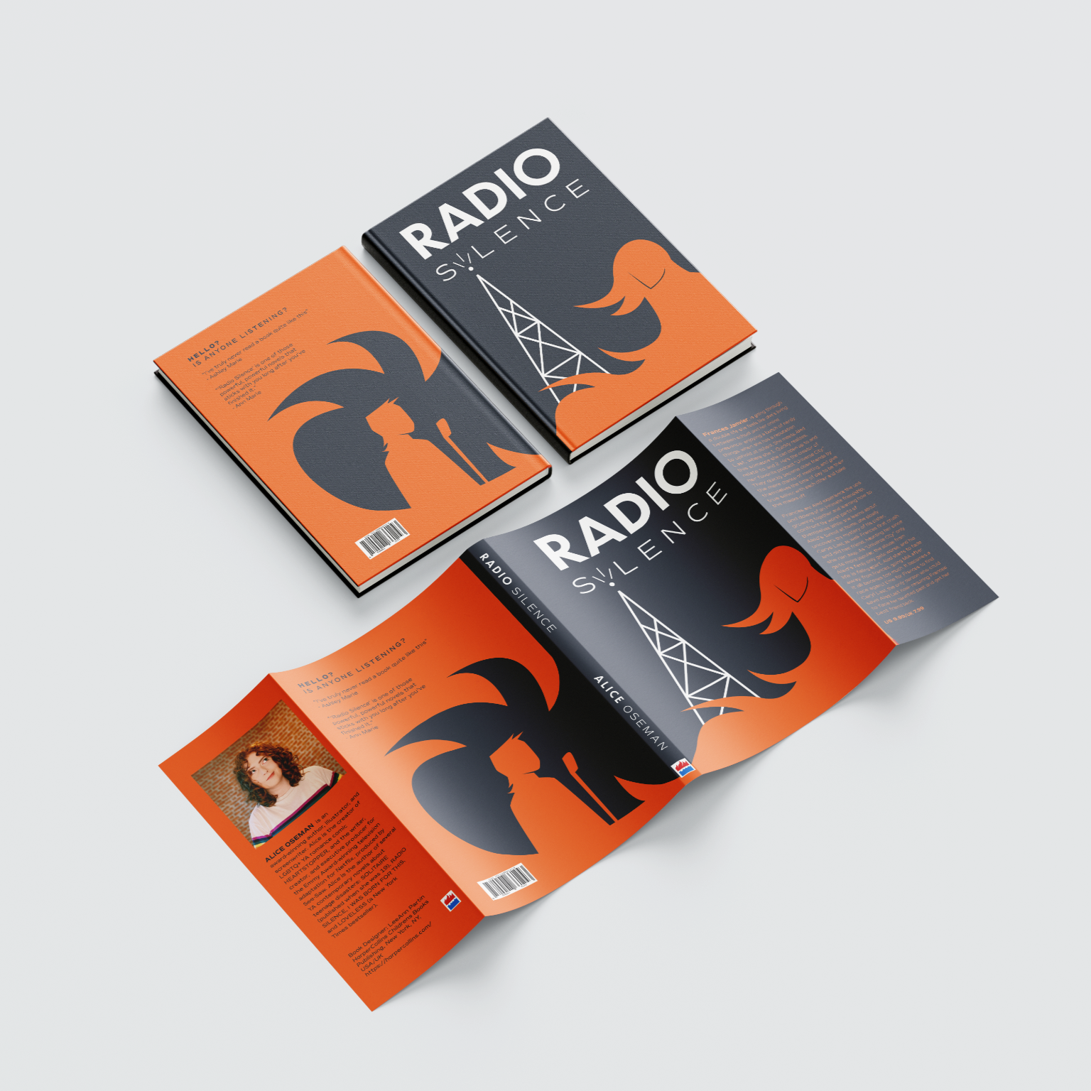
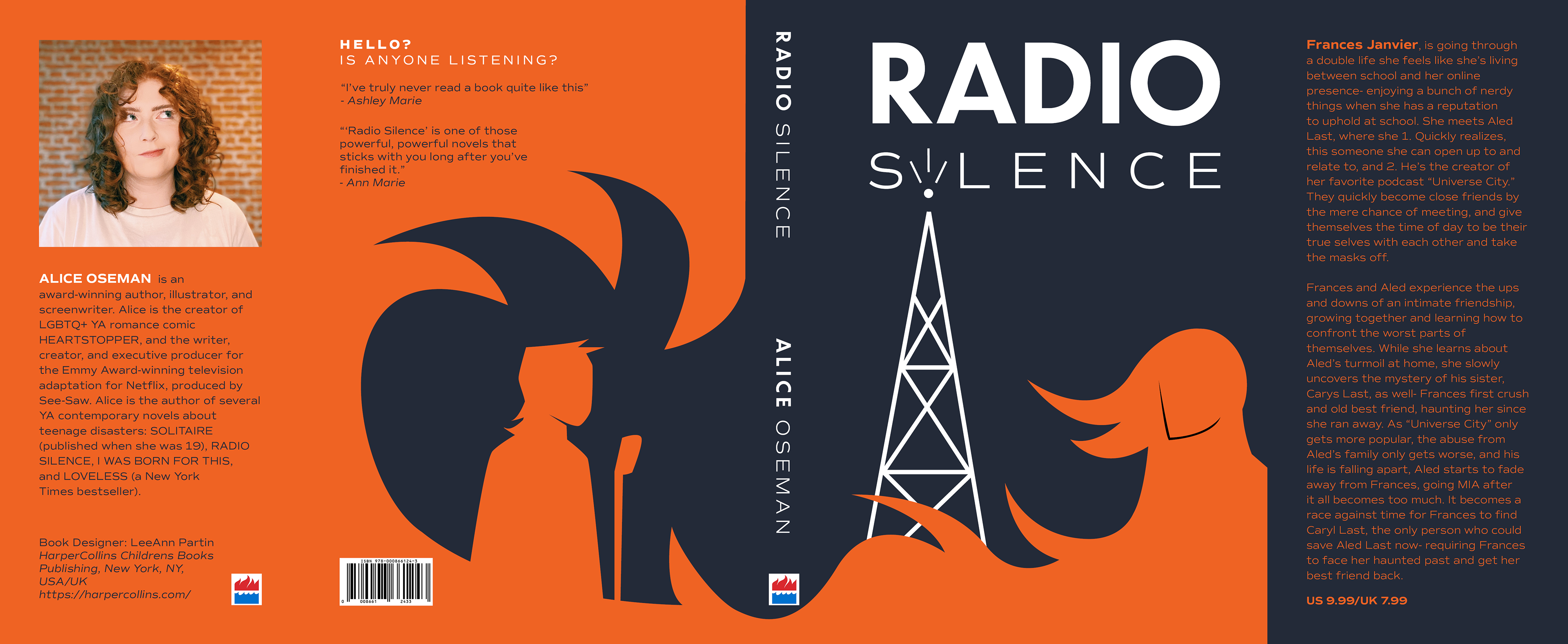
THE SOLUTION
RI wanted to stick with the dark background, as I think the mystery of the book is encompassed well through this- but I also add a pop of orange through the girl characters hair to look like fire.
The fire and the two characters on the cover are what the plot wholly revolves around, so I wanted to incorporate this in a simpler way.
I also wanted the title to feel like it had more of an intentional and memorable identity, with a sleek sans serif, that uses the radio tower as an additional motif.