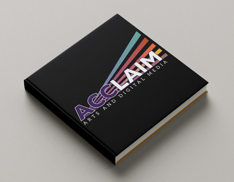
ACCLAIM YEARLY
LOOK BOOK
2026
ACClaim is the yearly look book for the School of Arts and Creative Industries, intended to highlight and showcase the achievements of all ten departments within the School.
This is the very first issue of the ACClaim look book, so the client was searching for a logo and outline for the layout of this book, with a theme that represents the togetherness, diversity, and fun in each of these departments.
THE GOAL
We have to figure out how to make a layout that can adapt and change depending on the yearly team's new theme or quantity of content. Our client also wants majority of the color to come from the photos; how do we make this a focal point, without having photos to choose from?
THE TEAM
LeeAnn Partin
Project Manager
Designer
Project Manager
Designer
Miranda Letz
Brand Manager
Designer
Alex Kipp
Production Specialist
Designer
Brand Manager
Designer
Alex Kipp
Production Specialist
Designer
SERVICES
Digital Publication Template
Print & Web
Print & Web
AUDIENCE
PRIMARY: ACC Administration & current/potential students involved in these creative programs
SECONDARY: Future Sponsors & Stakeholders
CONSTRAINTS
Going into this project, we were given little to no content to use or reference. Ideally, our client is also hoping to have only one spread for each department; with no content it's a little difficult to predict. The three people in our client team also have busy schedules, so we struggled to get all of them to meet at the same time.
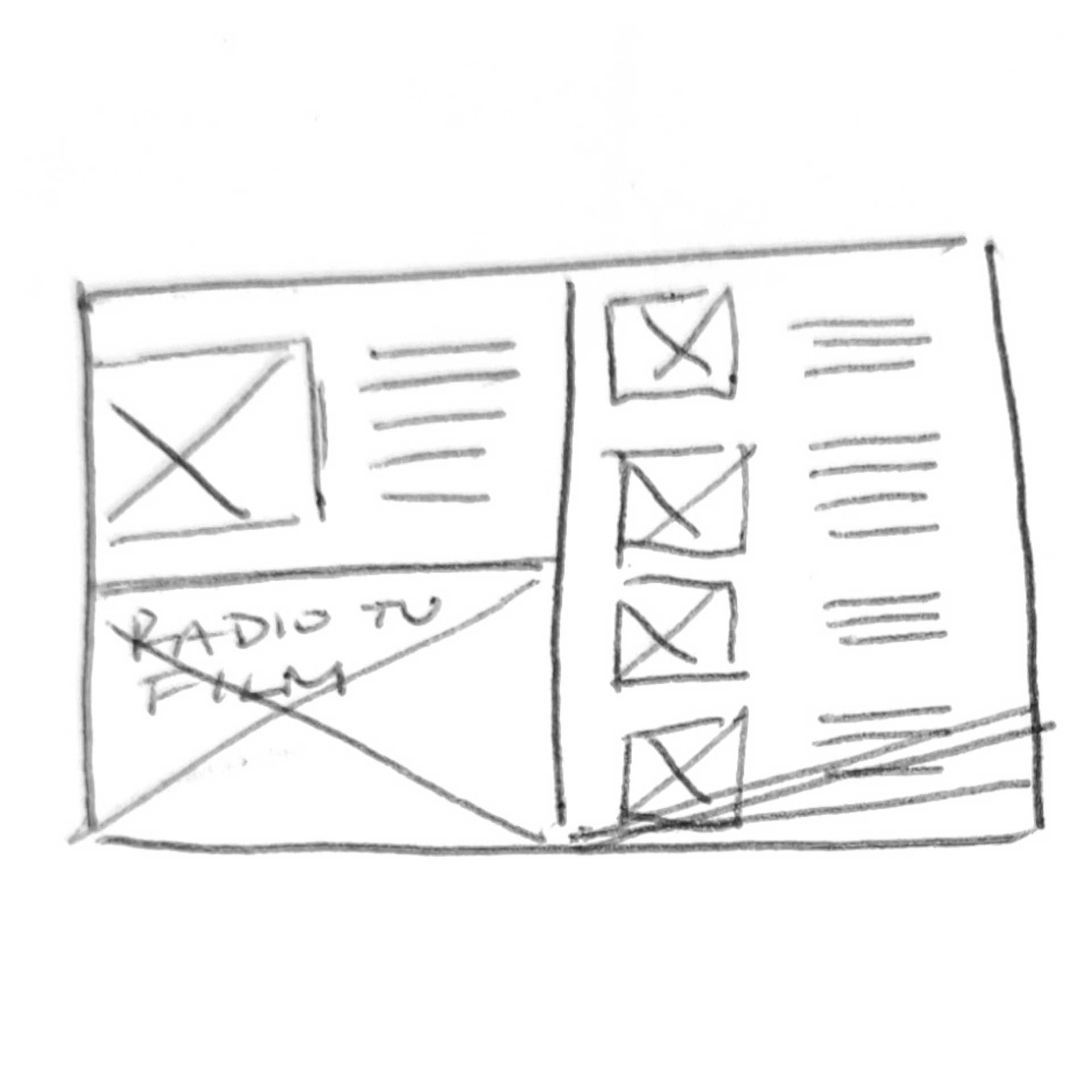
ROUND 1
We started simple with sketches, digital drafts, and organized future deadlines based on the table of contents given to us.
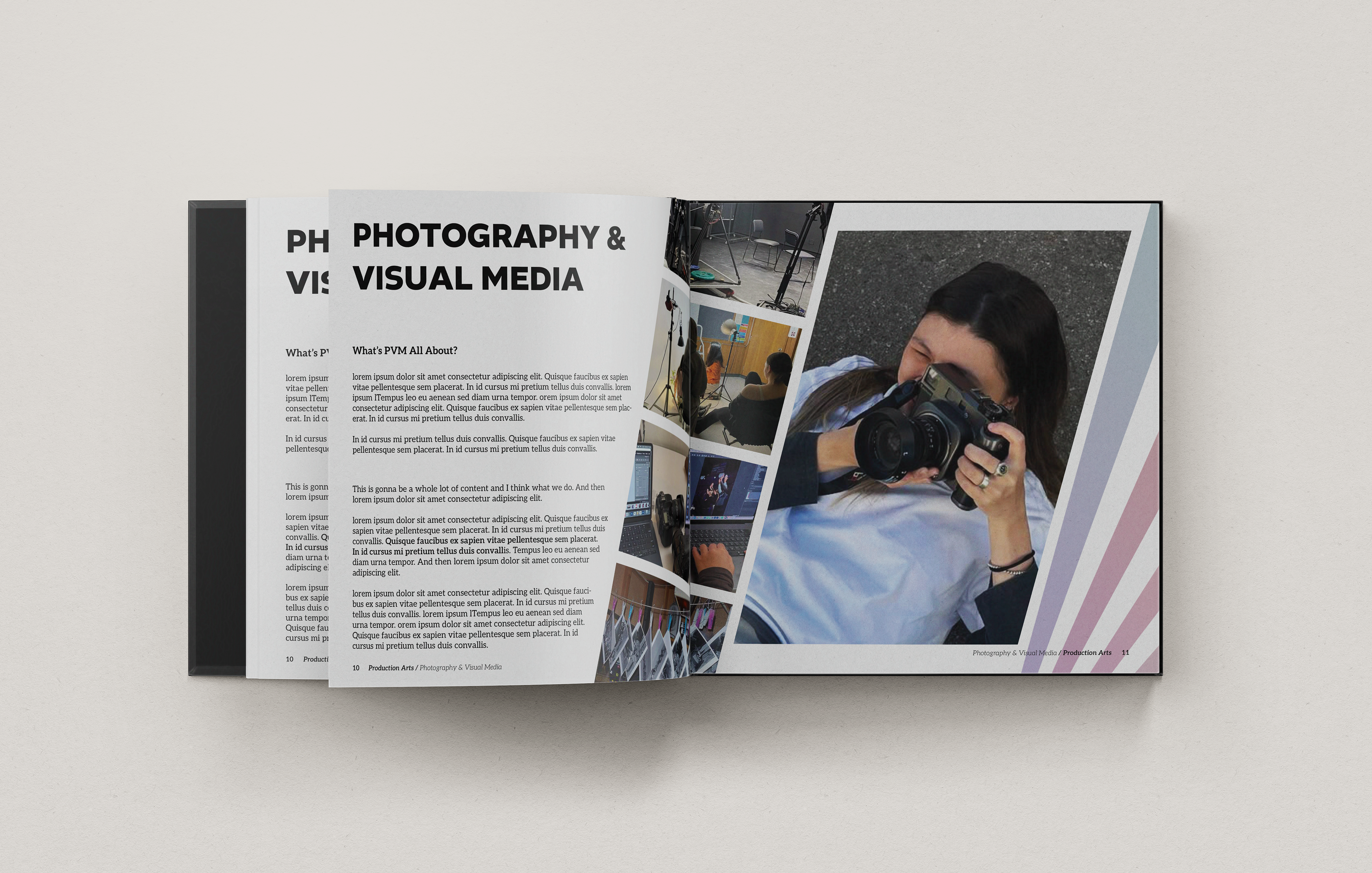
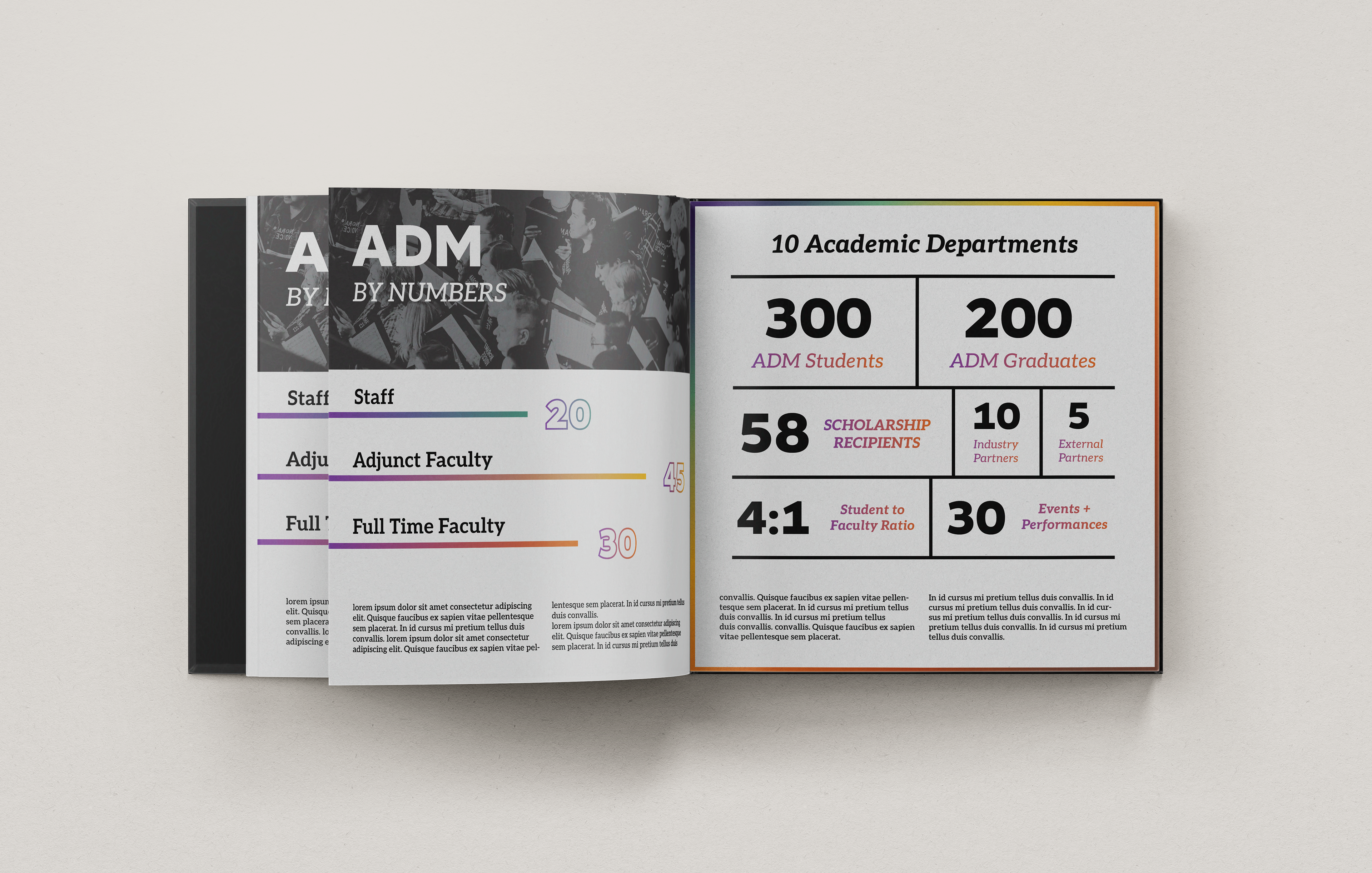
We each had one version used for the spreads we chose, consisting of a data splash, introduction page, and main layout for the department spread. Since mine was chosen for the main layout, we used it as a reference for our future iterations.
ROUND 2
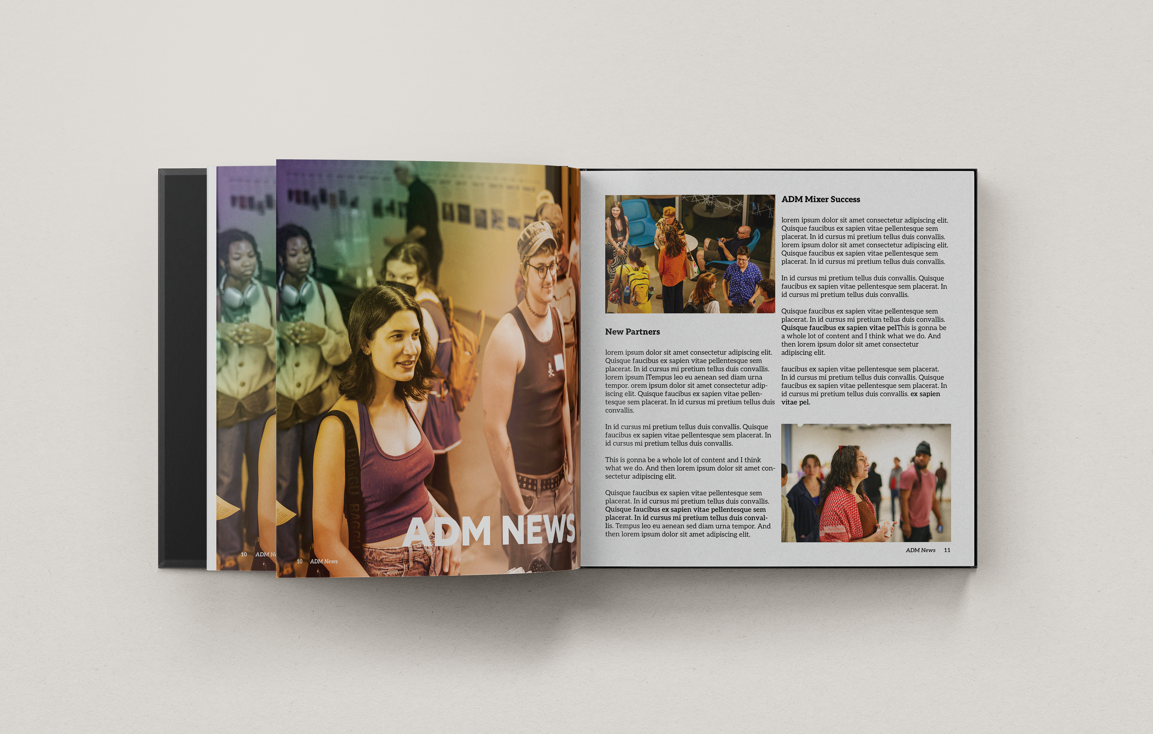
After feedback from last round, this round we really honed in on bringing these colorful brand elements into these majorly white pages. We also wanted to make sure that we designed layouts with photo heavy concepts.
ROUND 3
At this point, we're more than halfway through the project when one of our three clients had just come back after a long break. With surprising feedback and a much shorter deadline than before, different pages from old versions were chosen, new text variations needed to be made, and our introduction pages needed to be repurposed!
It was a huge time crunch and required revisions for several pages that we hadn't expected at all. My intro page and data splash page were brought back to the new spreads, and now we're starting to go through all spreads to start matching consistency.
It was a huge time crunch and required revisions for several pages that we hadn't expected at all. My intro page and data splash page were brought back to the new spreads, and now we're starting to go through all spreads to start matching consistency.
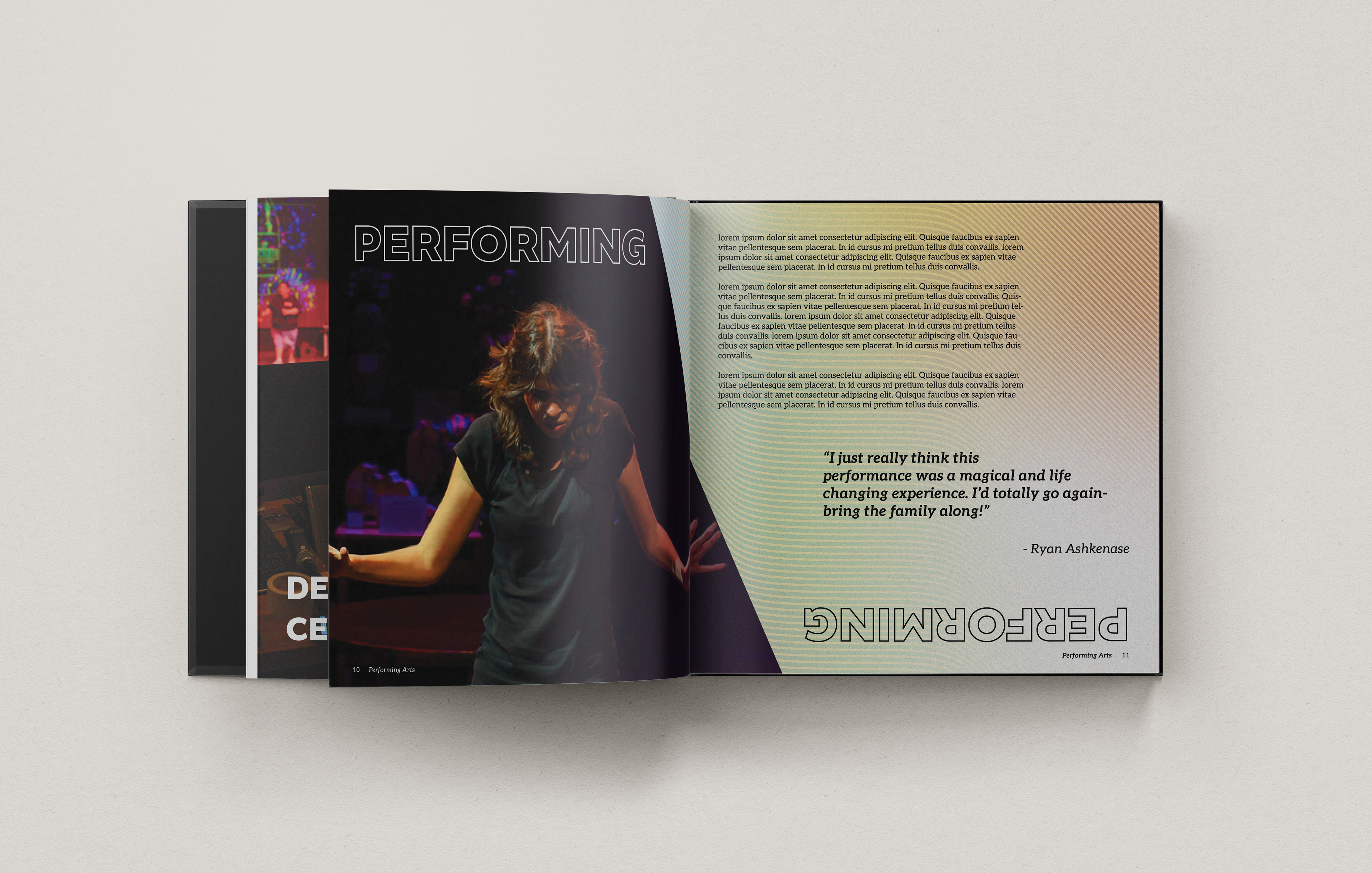
THE SOLUTION
The look book turned out beautifully! My only wish being that we had more time to push it towards the printing stage, and having the opportunity to help fill in the content ourselves. By creating multiple text variation layouts, using photos from ACC, and utilizing the color palette to draw consistency between pages, we created a foundation that can be adapted easily.
Starting from scratch isn't a walk in the park, and having to create a template for future designers is even harder, but we were definitely successful creating a clean, expressive, and eye-catching book to represent the School of Arts and Creative Industries.